Have you ever landed on a website and been immediately drawn in by that prominent, eye-catching section at the top? That's often a Hero widget doing its job - blending compelling visuals with key messages to instantly capture visitor attention and set the tone. While Sitefinity is a powerful and flexible platform, especially with its Next.js renderer, it gives you the exciting opportunity to craft custom components like a Hero widget, perfectly tailored to your project's unique needs. In this article we are going to do just that! We'll build a custom Hero widget from scratch using the Sitefinity Next.js SDK and React. So, let's roll up our sleeves and explore how to build one!
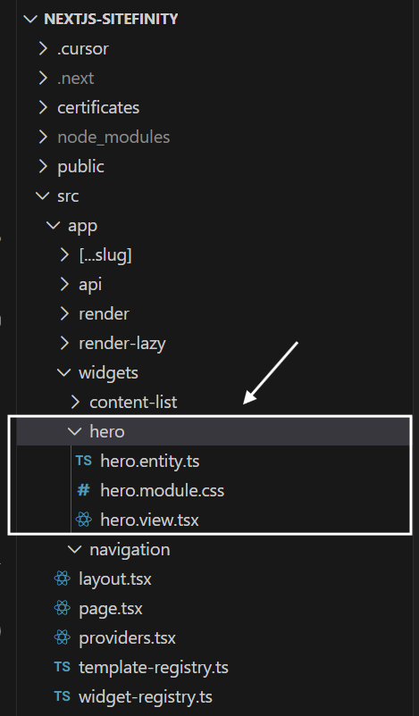

Building the entity: hero.entity.ts
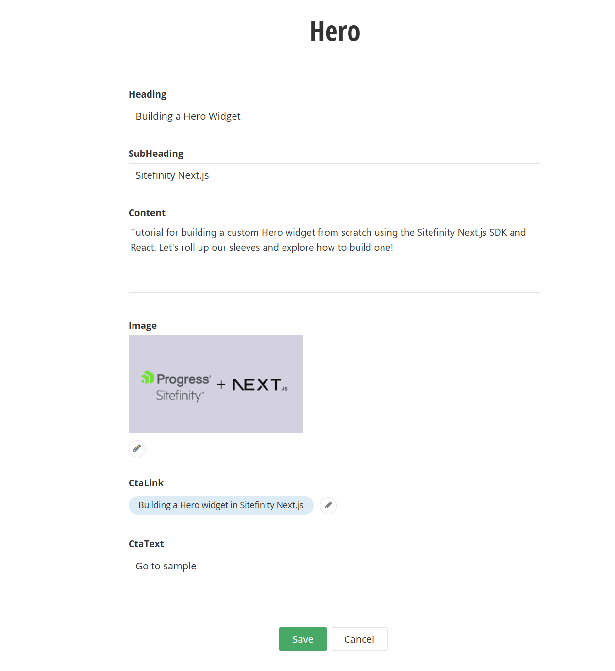
Our first step is to define the structure of our Hero widget. This means specifying what pieces of information a content editor can manage for this widget. This is all done in the hero.entity.ts file, which acts as the blueprint for our widget's properties within the Sitefinity backend.
Let's break down what these decorators and properties mean:
Building the React Component: hero.view.tsx
Let's walk through the key parts of this component:
Initial Setup:
dataAttributes = htmlAttributes(props): These attributes are crucial. It is required to include certain custom html attributes which allow Sitefinity's page editor to recognize and interact with the widget when you're in edit mode (e.g., for drag-and-drop, editing the widget in the backend).entity = props.model.Properties: This conveniently gives us access to all the properties we defined in HeroEntity (like Heading, Image, etc.) that the content editor has filled in.sanitizerService = SanitizerService.getInstance(): We initialize an instance of Sitefinity's SanitizerService. This is a vital tool for security. It cleans the HTML, removing any potentially harmful scripts or tags to prevent XSS attacks.
Fetching Content Details:
- We first extract the ID (
selectedImageId) and provider source (selectedImageSource) of the chosen image from the entity.Image property. - If an image has been selected (
entity.Image && selectedImageId), we use RestClient.getItemWithFallback<ImageItem>({...}). This powerful function from the Sitefinity Next.js SDK asynchronously fetches the full details of the selected image item from Sitefinity. This includes its URL, alternative text, dimensions, and available thumbnails. We pass props.requestContext.culture to ensure we get the image appropriate for the current language version of the page. - A similar process happens for the Call to Action (CTA) link. If a page has been selected in
entity.CtaLink and entity.CtaText (the button text) is provided, we fetch the details of that page (most importantly, its ViewUrl) using RestClient.getItem<PageItem>({...}).
Security is Key: Sanitizing HTML:
- The
safeSanitizeHtml function is a helper we've defined. It takes an HTML string as input (which could come from our Heading, SubHeading, or Content fields) and uses the sanitizerService.sanitizeHtml() method. This method cleans the HTML, removing any potentially harmful scripts or tags, which is a critical step to prevent cross-site scripting (XSS) vulnerabilities. - Before rendering, we process
entity.Heading, entity.SubHeading, entity.Content, and entity.CtaText through this sanitization function.
Rendering the Hero:
- The
return (...) block contains the JSX that defines the HTML structure of our Hero widget. - You'll notice
dangerouslySetInnerHTML={{ __html: heading }}. The name "dangerouslySetInnerHTML" sounds alarming, but because we have already sanitized the heading (and subHeading, content, ctaText) using our safeSanitizeHtml function, it's now safe to use. This approach allows us to render any legitimate HTML formatting (like bold text from the rich text editor for Content) that the content editor intended. This is the correct and safe way to handle HTML content in Next.js, and it's the direct equivalent of Html.Raw() in MVC. - The CTA button (
<a> tag) is rendered conditionally: only if pageItem (meaning a page was selected in the widget designer and successfully fetched) and ctaText (the button text) are available. Its href is set to pageItem?.ViewUrl. - For the image, we first check if
imageItem and its Thumbnails property exist. Sitefinity can automatically generate different sizes (thumbnails) of an image. Here, we're filtering to find a thumbnail specifically titled 'sm' (you can configure thumbnail profiles in Sitefinity). We then map over the found thumbnails (though we expect one 'sm' thumbnail) to render the <img> tag. Using imageItem.AlternativeText for the title and alt attributes is important for accessibility. If you don't have the image thumbnails defined in your system, you could use imageItem.MediaUrl as the source for the image tag.
Register your widget
After creating your hero.entity.ts and hero.view.tsx files, the final step to make your custom Hero widget available in the Sitefinity page editor is to register it. This is typically done in a widget-registry.ts file (or a similarly named file, depending on your project's structure) within your Next.js application.
This registry acts as a directory that tells Sitefinity about all the custom widgets available for your site, how to render them, and what data they expect.
Updating the Widget Registry
You'll need to import your newly created HeroEntity and HeroView. You'll also typically import WidgetMetadata from the Sitefinity SDK if you need more advanced editor configurations, though for a basic title, it's straightforward.
Here's how you would add your Hero widget to the collection:
Styling the Hero widget: hero.module.css
For styling React components, especially in a Next.js environment, CSS Modules are a fantastic approach. They locally scope your styles by default, which means the class names you define in one module won't accidentally clash with class names in another. This helps keep your styling organized and maintainable.
In our hero.view.tsx component, you'll notice the line:
import styles from './hero.module.css';
This imports a CSS file named hero.module.css (which you would create in the same directory as your hero.view.tsx file). The styles object then becomes a mapping of the class names you define in your CSS file to unique, generated class names. For example, if you have .heroWrapper in your CSS, you'd use it in your JSX like className={styles.heroWrapper}.
Here's a sample set of styles you can use for hero.module.css to achieve a modern and appealing look for your Hero widget:
And that's it!
We've successfully built a custom Hero widget in Sitefinity using the Next.js SDK. We covered defining the entity, creating the React view component, fetching and displaying content like text, images, and page links, the importance of sanitization, registering the widget, and finally, adding some CSS Module styles."
This is just a starting point, of course. You could extend this with more fields, different layouts, or more complex interactions. But hopefully, this gives you a solid foundation for building your own custom Sitefinity Next.js widgets.
getting things done, sitefinity